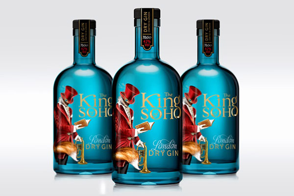
UK-based 1HQ designed this lovely bottle for The King of Soho, a premium gin. The design is a real shelf stand-out, and each element, from the velvet suited man, the fox’s tail, the trumpet and the book, harks back to Soho’s rich history.
Pratiksha Suryawanshi, from Mumbai, India, created these conceptual visuals named ‘The Blame Game’. Pop art-like, they show, in Pratiksha’s words, ‘accusations exchanged among people who refuse to accept sole responsibility for some undesirable event.’
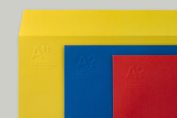
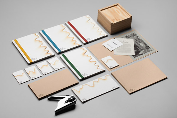
Finnish Werklig gave Aalto University a simple but strong identity. The theme only features three basic colours, with grey as an exception, for the condolence envelope and card. The emblem was toned down by embossing it to the envelope and the letterhead.
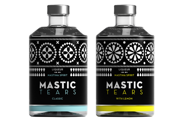
Dolphins from Greece designed the label for a liqueur, inspired by the black and white geometric decoration on the building facades of Chios mastic villages, such as Pyrgi.
The newly created visual identity for glassblower Jeremy Maxwell Wintrebert by Spanish studio Hey. The identity is simple yet elegant with white, black and kraft. Textures win over colors and details are references to the handmade.
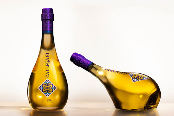
The design for Callegari Olive Oil by Pereira & O’Dell aims to bring the product bottle to the table, instead of using olive oil dispensers. A minimal and modern bottle that can stand upright or on its side, and a classic perfume bottle, to dispense the oil on salads.
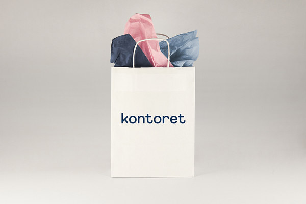
Designed by Werklig from Finland, on a very strict design grid, the identity and typeface for Kontoret shows a strong link to the traditional office enviroment with a minimalist Scandinavian twist, with a custom set of icons for the signage system.
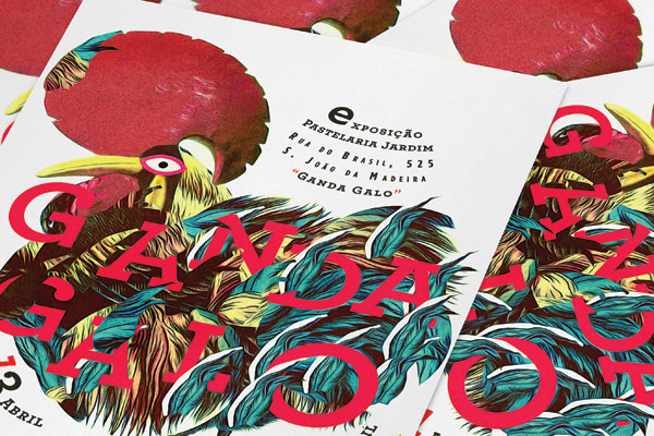
‘Ganda Galo’ is a Portuguese expression that states that something has gone completely wrong. Also, the rooster (Galo) is a symbol of the country. This series of promotional items, posters, flyers and cards by Royal Studio promote a handicraft event.